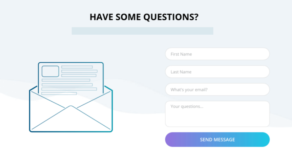
Contact Form Conversion-Killer #1: Hard To Fill Out
Website forms are often an important part of the customer experience. The look of your contact form can affect how many people actually use it. Studies have shown that making sure a form looks and functions correctly can increase conversion rates by as much as 200 percent! A professional and easy-to-use contact form will encourage more complete form fills.
How do you do this? A recent eye-tracking study has shown that the layout of form fields is crucial to the completion rate of forms. Users were more likely to complete a form if the layout followed normal reading patterns with properly sized form fields and a simple one-column layout.
Here’s an example of a less than perfect form:

Here’s a great one:

We’ve got 3 more tips coming on how to make your contact forms work for you, so stay tuned!
Keep reading for more details on how to make your contact forms work for you!


